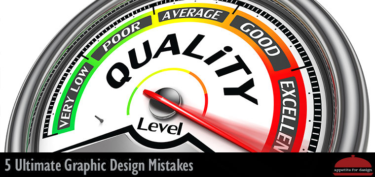
Things that Graphic Designers Should Avoid at All Costs
1. Using Web Graphics on Printed Material.
With many young designers coming from a pre-dominantly web design background the transfer over from web design to design for print can bring with it a multitude of design sins. Images supplied at 72 dpi and crunched down to load fast on a website are going to reproduce very badly in print you can get away with small thumbnails but blowing things up to any appreciable size is going to be pushing your luck. There are a number of online sites offering free or very cheap quality hi-resolution images which are a good source for suitable imagery.
Also, creating a logo with only web use in mind is a bad idea. You never know when you’ll need to use it for a print document. Trust me it happens, and your 72 dpi web logo will look bad. Spend the extra money to get a vector logo done right. Already have a web logo you love? There are services that can create a vector version for you. Depending on how detailed your logo is, it might not look exactly the same, but a good designer can get super close.
2. Forgetting About or Not Allowing Enough Bleed.
A very common error is to send to print a document or flattened image that is not properly set up for a bleed. Many have no bleed at all. Generally speaking, you should allow at least 3mm around every cut off edge. Failing to do so will give the printers no leeway and will either crop off the side of the page or give you an awkward white border. It is always a good idea when supplying print files to save original files (for example layered PSD, Illustrator, or InDesign files) then if things need extending or cropping you can do this on the background layer and hopefully cut down your work. Otherwise, you might have to redo the whole thing.
3. Using Obscure Fonts and Not Embedding or Outlining Them for Output.
We’ve all been guilty of this at some point and things are generally fine if you are going to be the only person accessing your artwork or documents. However, if someone else needs to amend the files or use your vector logo on one of there publications. Unless you package up the used fonts, they are not going to be able to open the files correctly and some software programs may replace any unknown fonts with a default. This is a particular problem when you need to dig out stuff that was created several years previously and you no longer have your old fonts installed. Saving all your fonts in a folder with the original document is a good habit to get into.
4. Supplying Print Ready Artwork Using Spot Colors or RGB
There are valid reasons for using spot colors in artwork, logos that need to reference particular Pantone colors for example. In general design work, however, most print is sent through on 4 color presses CMYK with occasional 5th color for luminous or metallic color or for spot UV varnish. It is very common for lazy designers to just place RGB images into files and expect the vibrant colors seen on screen to reproduce in print. Today’s software will most likely convert these colors for you when you export the final files, but CMYK colors aren’t as bright as RGB. If you want a better representation of what your final print will look like, use CMYK in your images from the beginning. If you will be using the images for your website as well as print, you’ll want to save two copies since the original RGB version will represent better online. Keep in mind though, that even if you “do everything right” color variations are still often a hazard due to differences in monitor calibration, printers, inks, etc.
5. Not Trusting Your Designer to do Their Job
There’s a saying in the service business world: The customer is always right.
There’s another saying I like better. “Trust the designer.” For some, it can be hard to give up control of every decision. Your graphic designer is the one with the training. They’re the one with a designer’s eye. Trust them to make choices that reflect you.
If you’re not careful, you can easily begin to nitpick. Hopefully, you’ve hired a professional. You need to trust their training. Check out their portfolio and pick someone who designs things that you like.
Trusting your designer is essential to getting quality work done. You’re paying them. Trust the reason you chose them.
Thank you for these wonderful tips. They are definitely things to keep in mind.
Thanks, Stephanie! I’m glad they were helpful.